
Address: 2nd Floor, Malerkotla Rd, Near Fashion Point, Sarinh, Ludhiana
Address: 2nd Floor, Malerkotla Rd, Near Fashion Point, Sarinh, Ludhiana
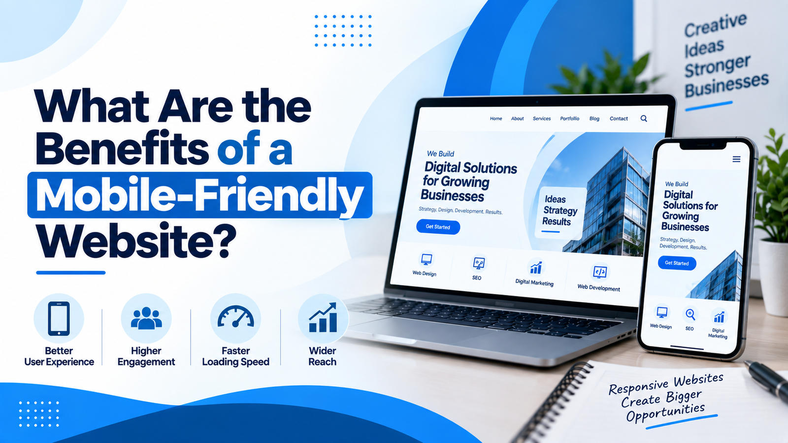
In today’s age, one relies on their smartphone for anything from searching for something to comparing products and contacting companies, and even buying products online. This shift in user behavior makes it imperative that the website be mobile friendly and work well on different screen resolutions.
What makes a website mobile friendly is that it automatically changes its content, images, buttons, and layout based on the user’s device, hence providing them a more comfortable experience while browsing the site. Proper maintenance of the advantages of having a mobile friendly website designing in Ludhiana can prove very helpful for business owners in making informed decisions regarding their website.
A mobile-friendly website is created in order to ensure that websites work properly on different screen sizes such as smartphone and tablet users. Unlike traditional websites with a desktop version that is hardly readable on small screens, the website automatically changes its components depending on the screen size.
This kind of website can modify image sizes, relocate content sections, alter navigation bars and even create touchable buttons. There will be no need for users to enlarge the web page or to scroll to the right in order to read the content. This website design technique is related to website design ideas.
Mobile devices bring about a significant amount of website traffic in various industries. Should these users find it challenging to navigate around the website using their phones, they are likely to abandon your website in search of another firm.
A mobile-friendly website will help you provide your visitors with all the necessary information regarding your services or products, pricing, contact information, and location.
It will also assist your business in generating more leads or sales.
User experience is perhaps one of the most important benefits that an mobile-responsive site provides. People tend to want websites to be easy and convenient to navigate.
A properly built website makes it easy for people to:
This can motivate people to stay on your site for longer.
People use their smartphones quite often to look for businesses, products, and services. Mobile friendly website design will make it easier for such individuals to browse through your website.
With responsive web design, you can have your website content scale down or up automatically according to the device screen sizes. Responsive design makes it easy to have a similar website experience for both desktop and mobile site users.
Website usability is an essential element of establishing a good presence online. Search engines strive to deliver useful and easily accessed websites to their users.
A mobile-friendly website will assist in building up a better SEO approach since it allows users to interact more conveniently with the content through their mobile phones.
Moreover, a business can integrate its mobile optimization with AI Search Optimization to increase the usability and accessibility of the website content.
Mobile users frequently look for fast access to information. Web sites that contain big-sized images or unnecessarily complex layouts may provide users with negative browsing experiences.
Mobile site design implies providing users with easy access to necessary information while designing a simple layout.
Image optimization, cutting unnecessary scripts, improving navigation systems, and website design can be helpful in providing a better browsing experience.
The website should not just inform people; it should also make them take some kind of action. Buttons that will be visible and informative like “Call Now,” “Get a Quote,” “Contact Us,” or “Buy Now” may help people who visit the website via their smartphones to perform further actions.
This can be helpful especially for service-based or commercial websites. Proper mobile usability will also be helpful for performing Website Conversion Optimization.
It is convenient for customers who search through different categories or purchase items.
Small firms stand to gain much from the existence of a professional website that is responsive.
A customer searching for a firm locally can find the firm on search engines, social networks, ads, or references and then access their website right away using a smartphone.
It helps small businesses get a professional appearance without the need to have separate websites for desktops and smartphones.
The benefits of responsive website design are not only limited to the aesthetics of websites when viewed on mobile phones. The following are among some of the notable advantages of responsive web design:
Businesses that aim to have a web presence need to think about Professional Website Design for their website design with a mixture of aesthetics, usability, functionality, and organizational objectives.
The mobile user interface should be made to help customers easily navigate through different categories of products and learn about them. Other things that businesses need to keep in mind are product images, product description, filters, shopping cart, and checkout.
Along with mobile website optimization, companies need to create clear E-commerce Product Listings for each product.
The advantages of mobile responsiveness can prove to be quite useful for companies that rely heavily on visibility online. The use of a responsive website can be effective in ensuring consistency along with the fact that there is no requirement of maintaining separate websites.
Responsive web design, when used along with quality content, SEO, call-to-action, and website performance can turn out to be an integral component of digital marketing for a company.
Businesses can link mobile optimization services with other services like Website Designing in Ludhiana, SEO, online advertising, and conversion-based website designing.
A mobile optimized website is an integral component of a modern day website. There are many advantages of having a mobile optimized website depending on the size of the business.
The responsive nature of a mobile optimized website allows businesses to create consistency in their website design across smartphones, tablets, and desktops. When developing either a new or existing website, mobile optimization should always be taken into consideration.
DigiWorkup enables businesses to develop modern websites that are responsive and user friendly. Contact DigiWorkup for professional website development services today to optimize your website for mobile users.
You can contact us on the phone number +91 73552-35100 for all your website design needs.



 Digi_workup